Objectives
Continue to enhance the IoT web site with additional Semantic-UI styles & Components
Setup
This lab assumes you have completed the last lab - an archive of the completed project can be found here:
Make sure you can 'serve' the project using harp. It should look like this:
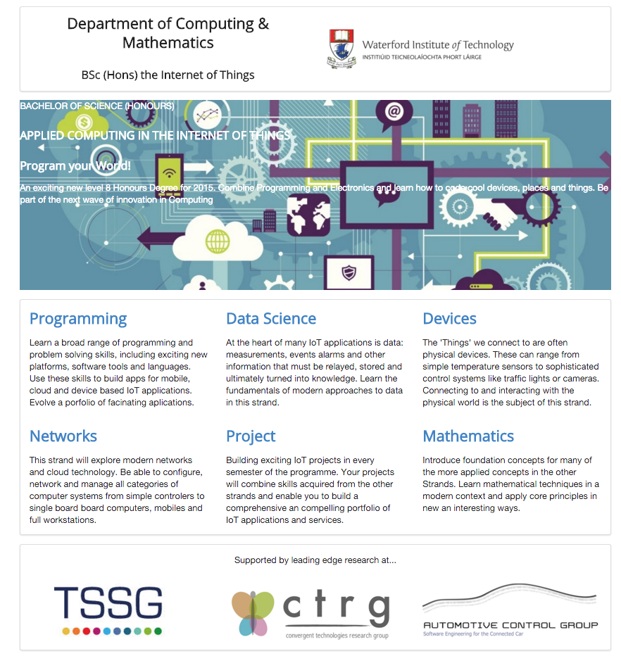
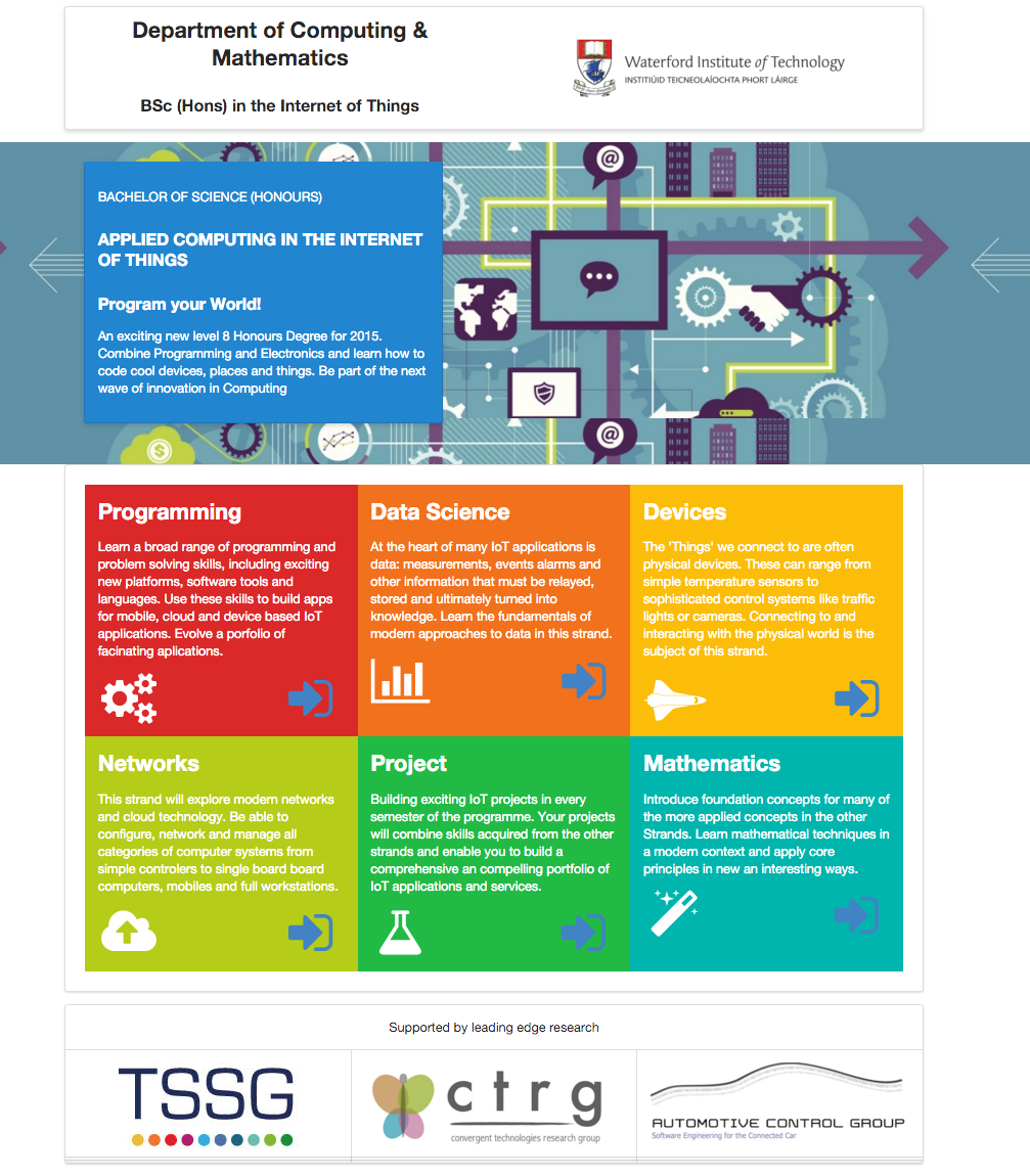
This lab will enhance the site to look like this:
Icons
We left the footer from last week looking like this:

with the task of making it look like this:

To do this, we can make use of the icons in Semantic-UI:
This is the current footer:
<footer class="ui segment">
  <p class="footer-social-links">
    <a href="http://www.facebook.com/witcomp"> facebook </a>
    <a href="http://twitter.com/ComputingAtWIT"> twitter </a>
    <a href="https://ie.linkedin.com/pub/computing-at-wit/a9/221/1b6"> linkedin </a>
  </p>
</footer>
It is just links with an icons. Here is a replacement:
<footer class="ui center aligned segment">
  <a href="http://www.facebook.com/witcomp"> <i class="large facebook icon"></i> </a>
  <a href="href='http://twitter.com/ComputingAtWIT"> <i class="large twitter icon"></i> </a>
  <a href="href='http://www.linkedin.com/pub/computing-at-wit">  <i class="large linkedin icon"></i> </a>
</footer>
Background colours
We will make the curriculum a little more eye catching but introducing some colour into each of the columns.
The framework defines a set of colours we can use:

(http://semantic-ui.com/usage/theming.html)
... and these can be used to give an entire section a colour:
_curiculum.ejs
...
    <article class="red column">
      <h2> <a href="strands/programming.html"> Programming </a> </h2>
      <p>
        Learn a broad range of programming and problem solving skills, including exciting new platforms, software tools and
        languages. Use these skills to build apps for mobile, cloud and device based IoT applications. Evolve a porfolio of
        facinating aplications.
      </p>
    </article>
...
Which will look like this:
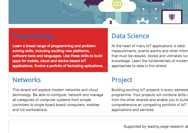
Note that the colour of the header is clashing with the new background colour - but also note that the paragraph text has been automatically coloured to white.
Recolour all sections now:
...
  <section class="ui three column row">

    <article class="red column">
      ...
    </article>

    <article class="orange column">
      ...
    </article>

    <article class="yellow column">
      ...
    </article>

  </section>

  <section class="ui three column row">

    <article class="olive column">
      ...
    </article>

    <article class="green column">
      ...
    </article>

    <article class="teal column">
      ...
    </article>

  </section>
...
Icons
We have already seen how to integrate icons into our site in step 2 (twitter, facebook and linkedin).
We can also enhance other aspects of the site using icons - perhaps as a visual cue or aid, or also a a prompt for navigability:
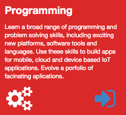
There is a rich set of icons here:
We are going to use this one for navigation:
and these ones for each of the strands:
This is how they are included:
<i class="huge settings icon"></i>
<i class="huge bar chart icon"></i>
<i class="huge space shuttle icon"></i>
<i class="huge cloud upload icon"></i>
<i class="huge lab icon"></i>
<i class="huge wizard icon"></i>
In _curriculum.ejs, experiment with the programming strand box:
...
    <article class="red column">
      <h2> Programming </h2>
      <p>
        Learn a broad range of programming and problem solving skills, including exciting new platforms, software tools and languages. Use these skills to build apps for mobile, cloud and device based IoT applications. Evolve a porfolio of facinating aplications.
      </p>
      <i class="huge settings icon"></i>
      <a href="strands/programming.html">
        <i class="huge sign in icon"></i>
      </a>
      </div>
    </article>
...
Try this now, the icons should appear on the programming strand + the 'sign in' icon should be a link to the programming strand page.
We might like to have the icons better spaced - in two columns perhaps. This can easily be done sing the grid mechanism we used for the header. Here is an alternative version:
...
  <article class="red column">
    <h2> Programming </h2>
    <p>
      Learn a broad range of programming and problem solving skills, including exciting new platforms, software tools and languages. Use these skills to build apps for mobile, cloud and device based IoT applications. Evolve a porfolio of facinating aplications.
    </p>
    <div class="ui two column grid">
      <div class="left aligned column">
        <i class="huge settings icon"></i>
      </div>
      <div class="right aligned column">
        <a href="strands/programming.html" class="strandlink">
          <i class="huge sign in icon"></i>
        </a>
      </div>
    </div>
  </article>
...
Note how the icons are now embedded in a 2 column grid - and the individual icons are left and right aligned.
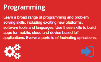
We can incorporate icons in a grid like this for all strands:
<section class="ui three column grid segment">

  <article class="red column">
    <h2> Programming </h2>
    <p>
      Learn a broad range of programming and problem solving skills, including exciting new platforms, software tools and languages. Use these skills to build apps for mobile, cloud and device based IoT applications. Evolve a porfolio of facinating aplications.
    </p>
    <div class="ui two column grid">
      <div class="left aligned column">
        <i class="huge settings icon"></i>
      </div>
      <div class="right aligned column">
        <a href="strands/programming.html">
          <i class="huge sign in icon"></i>
        </a>
      </div>
    </div>
  </article>

  <article class="orange column">
    <h2> Data Science </h2>
    <p>
      At the heart of many IoT applications is data: measurements, events alarms and other information that must be relayed, stored and ultimately turned into knowledge. Learn the fundamentals of modern approaches to data in this strand.
    </p>
    <div class="ui two column grid">
      <div class="left aligned column">
        <i class="huge bar chart icon"></i>
      </div>
      <div class="right aligned column">
        <a href="strands/data.html">
          <i class="huge sign in icon"></i>
        </a>
      </div>
    </div>
  </article>

  <article class="yellow column">
    <h2> Devices </h2>
    <p>
      The 'Things' we connect to are often physical devices. These can range from simple temperature sensors to sophisticated control systems like traffic lights or cameras. Connecting to and interacting with the physical world is the subject of this strand.
    </p>
    <div class="ui two column grid">
      <div class="left aligned column">
        <i class="huge space shuttle icon"></i>
      </div>
      <div class="right aligned column">
        <a href="strands/devices.html">
          <i class="huge sign in icon"></i>
        </a>
      </div>
    </div>
  </article>

  <article class="olive column">
    <h2> Networks </h2>
    <p>
      This strand will explore modern networks and cloud technology. Be able to configure, network and manage all categories of computer systems from simple controlers to single board board computers, mobiles and full workstations.
    </p>
    <div class="ui two column grid">
      <div class="left aligned column">
        <i class="huge cloud upload icon"></i>
      </div>
      <div class="right aligned column">
        <a href="strands/networks.html">
          <i class="huge sign in icon"></i>
        </a>
      </div>
    </div>
  </article>

  <article class="green column">
    <h2> Project </h2>
    <p>
      Building exciting IoT projects in every semester of the programme. Your projects will combine skills acquired from the other strands and enable you to build a comprehensive an compelling portfolio of IoT applications and services.
    </p>
    <div class="ui two column grid">
      <div class="left aligned column">
        <i class="huge lab icon"></i>
      </div>
      <div class="right aligned column">
        <a href="strands/maths.html">
          <i class="huge sign in icon"></i>
        </a>
      </div>
    </div>
  </article>

  <article class="teal column">
    <h2> Mathematics </h2>
    <p>
      Introduce foundation concepts for many of the more applied concepts in the other Strands. Learn mathematical techniques in a modern context and apply core principles in new an interesting ways.
    </p>
    <div class="ui two column grid">
      <div class="left aligned column">
        <i class="huge wizard icon"></i>
      </div>
      <div class="right aligned column">
        <a href="strands/programming.html">
          <i class="huge sign in icon"></i>
        </a>
      </div>
    </div>
  </article>

</section>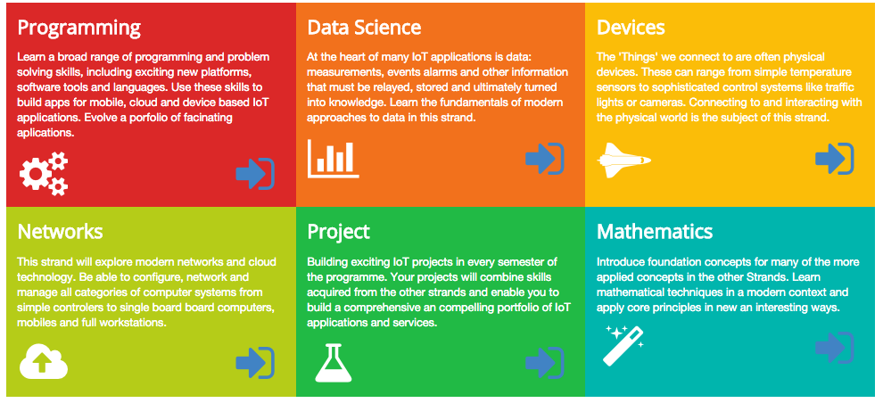
Padding, Raised and Stacked Segments
The range of options available for the segment class is worth exploring in detail:
Specifically :
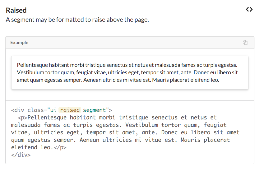
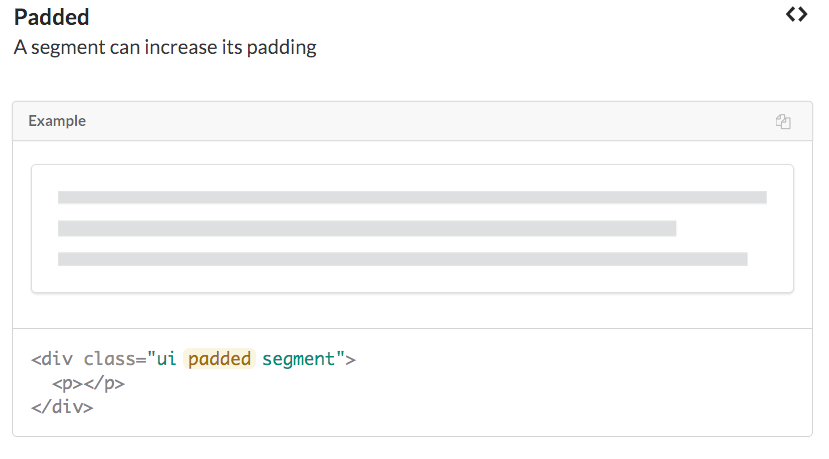
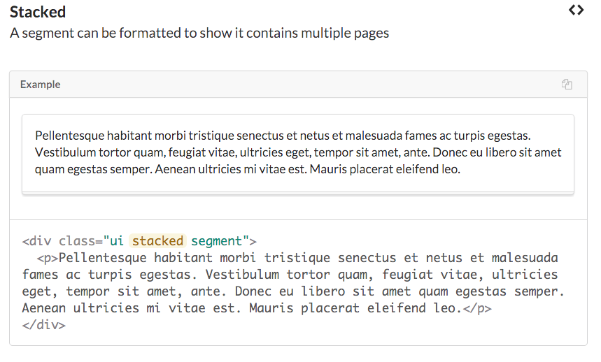
Contrast the following two version of the curriculum section:
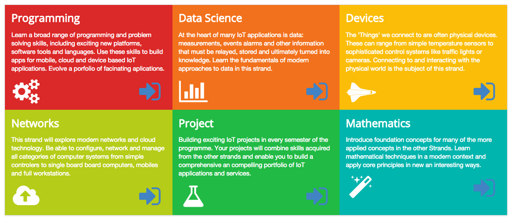
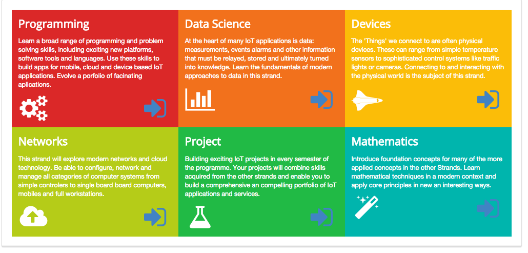
The latter has the following adjustments to its section class:
<section class="ui three column padded stacked grid segment">Type 'stacked' in the other segments. Eg. the header:

Strand pages
Our strand pages are still not rendering correctly:
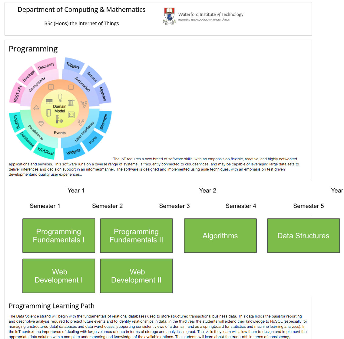
The images are not sized correctly, and the text is not flowing well. This is how we would like it to look:
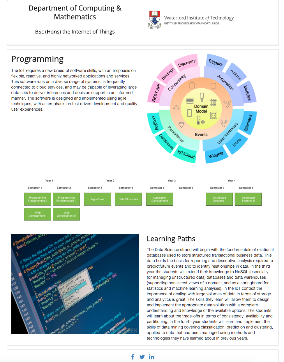
This is the current version of _programming.ejs:
<article>
  <h1> Programming </h1>
  <p>
    <img class="strand-right-img" src="../assets/images/iot/programming/programming-1.png">
    The IoT requires a new breed of software skills, with an emphasis on flexible, reactive, and highly networked applications and services. This software runs on a diverse range of systems, is frequently connected to cloudservices, and may be capable of leveraging large data sets to deliver inferences and decision support in an informedmanner. The software is designed and implemented using agile techniques, with an emphasis on test driven developmentand quality user experiences..
  </p>
</article>

<figure>
  <img class="strand-timeline-img" src="../assets/images/iot/timeline.png">
  <img class="strand-modules-double-img" src="../assets/images/iot/programming/programming-modules.png">
</figure>

<article>
  <h2> Programming Learning Path </h2>
  <p>
    The Data Science strand will begin with the fundamentals of relational databases used to store structured transactional business data. This data holds the basisfor reporting and descriptive analysis required to predict future events and to identify relationships in data. In the third year the students will extend their knowledge to NoSQL (especially for managing unstructured data) databases and data warehouses (supporting consistent views of a domain, and as a springboard for statistics and machine learning analyses). In the IoT context the importance of dealing with large volumes of data in terms of storage and analytics is great. The skills they learn will allow them to design and implement the appropriate data solution with a complete understanding and knowledge of the available options. The students will learn about the trade-offs in terms of consistency, availability and partitioning. In the fourth year students will learn and implement the skills of data mining covering classification, prediction and clustering, applied to data that had been managed using methods and technologies they have learned about in previous years.
  </p>
</article>
In order to improve the layout, we will need to incorporate a grid. This first requires a change to _layout.ejs:
...
<body>
  <section class="ui container">
    <%- partial("../includes/_header.ejs") %>
    <section class="ui grid segment">
      <%- yield %>
    </section>
    <%- partial("../includes/_footer.ejs") %>
  <section>
</body>
...
... we have made the main section a grid segment.
We can then put this to use in a reworked programming.ejs:
<article class="eight wide column">
  <h1> Programming </h1>
  <p>
    The IoT requires a new breed of software skills, with an emphasis on flexible, reactive, and highly networked applications and services. This software runs on a diverse range of systems, is frequently connected to cloud services, and may be capable of leveraging large data sets to deliver inferences and decision support in an informed manner. The software is designed and implemented using agile techniques, with an emphasis on test driven development and quality user experiences..
  </p>
</article>

<aside class="eight wide column">
  <img class="ui image" src="../assets/images/iot/programming/programming-1.png">
 </aside>

<figure class="sixteen wide column">
  <img class="ui image" src="../assets/images/iot/timeline.png">
  <img class="ui image" src="../assets/images/iot/programming/programming-modules.png">
</figure>

<aside class="eight wide column">
  <img class="ui image" src="../assets/images/iot/programming/programming-2.jpeg">
</aside>

<section class="eight wide column">
  <h2> Learning Paths </h2>
  <p>
    The Data Science strand will begin with the fundamentals of relational databases used to store structured transactional business data. This data holds the basis for reporting and descriptive analysis required to predictfuture events and to identify relationships in data. In the third year the students will extend their knowledge to NoSQL (especially for managing unstructured data) databases and data warehouses (supporting consistent views of a domain, and as a springboard for statistics and machine learning analyses). In the IoT context the importance of dealing with large volumes of data in terms of storage and analytics is great. The skills they learn will allow them to design and implement the appropriate data solution with a complete understanding and knowledge of the available options. The students will learn about the trade-offs in terms of consistency, availability and partitioning. In the fourth year students will learn and implement the skills of data mining covering classification, prediction and clustering, applied to data that had been managed using methods and technologies they have learned about in previous years.
  </p>
</section>
We are using the 16-column grid as defined by semantic. Every time we are specifying eight wide column we are effectively consuming half of the available width. A `sixteen wide column' is then the full width.
Make sure you can relate the above use of these grid parameters to the actual layout.
When you get this working - adapt all of the strand pages to follow a similar model.
Banner
Currently the banner/summary section needs some attention:
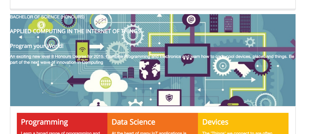
The text is not really legible - and is too wide to read. This is what we would like to have:

Notice how the images is stretched to the edges.
The first step will be to rework the index.ejs page to have the image adjusted to the full width of the page:
<body>
  <section class="ui container">
    <%- partial("includes/_header.ejs") %>
  </section>
  <section class="banner">
    <section class="ui container">
      <%- partial("includes/_summary.ejs") %>
    </section>
  </section>
  <section class="ui container">
    <%- partial("includes/_curriculum.ejs") %>
    <%- partial("includes/_sponsors.ejs") %>
    <%- partial("includes/_footer.ejs") %>
  </section>
</body>
In the above adjustments, we have excluded the banner section from the container class - which achieves the desired effect. Try it out now...
We still haven't Here is a replacement for the _summary.ejs contents:
<section class="ui grid">
  <article class="ui seven wide column raised blue segment">
    <div>
      <p>
        BACHELOR OF SCIENCE (HONOURS)
      </p>

      <h3>
        APPLIED COMPUTING IN THE INTERNET OF THINGS
      </h3>

      <h3>
        Program your World!
      </h3>
      <p>
        An exciting new level 8 Honours Degree for 2015. Combine Programming and Electronics and learn how to code cool devices, places and things. Be part of the next wave of innovation in Computing
      </p>
    </div>
  </article>
</section>
We have wrapped the <article> in a grid section, and set the article to be seven wide. Remember, the grid has a notional 16 columns, so this width is less than half of the screen. The page should look like this now:

Responsive Grids
Try narrowing making the browser very narrow - like this:
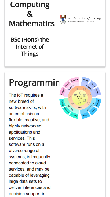
... and this:
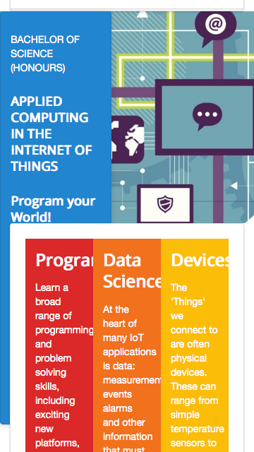
Although the images are resized - the home page becomes unreadable as the width shrinks. This would imply our page is 'unresponsive' - it cannot adequately render on a small form factor device in a legible manner.
One of the keys to responsive design in semantic are options available in the grid system:
Particularly the Responsive Grids - and Stackable grids in particular:
Back to _curriculum.ejs - adjust the enclosing <section> with a new class - stackable:
<section class="ui three column padded stacked stackable grid segment">Immediately the grid becomes more readable:
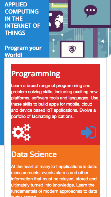
We can also apply stackable to the headers and sponsors sections - which will render on narrow screens like this:


Try this now and make sure your site is responding as above on small screen sizes.
Layout
The _layout.ejs file in strands offer us another major opportunity to improve a large part of the site by just editing a single file. First, browse the strand pages using a small width browser - the pages will look like this:

If we make one small change in _layout.ejs - making the main section stackable:
<body>
  <section class="ui container">
    <%- partial("../includes/_header.ejs") %>
    <section class="ui stackable grid segment">
      <%- yield %>
    </section>
    <%- partial("../includes/_footer.ejs") %>
  <section>
</body>
... then all the strand pages are transformed:
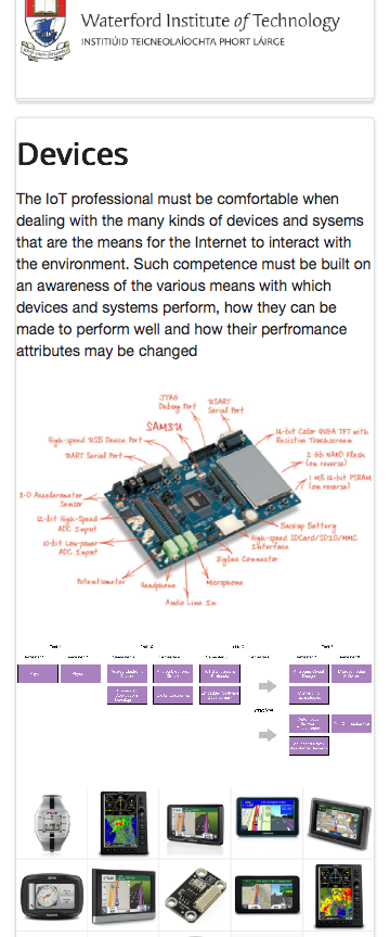
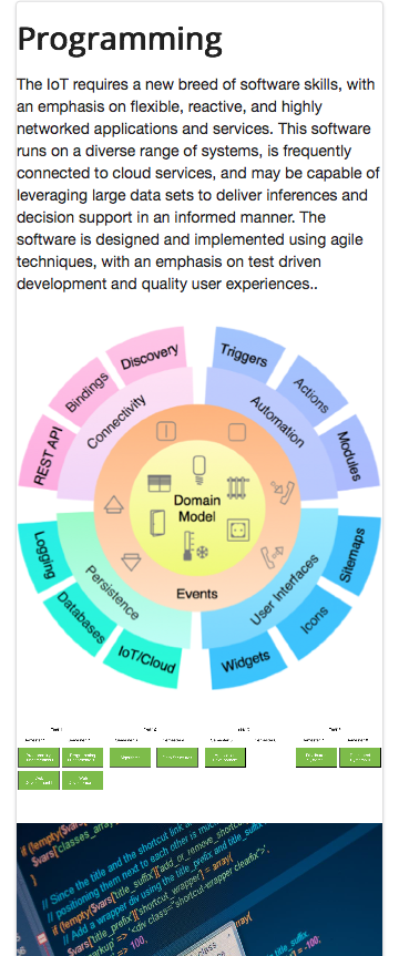
This demonstrates a major benefit of using shared layouts - incremental improvements in the layout are immediately available on all dependent pages.
Loading Semantic-UI
Currently, we have downloaded a copy of the Semantic-UI framework and stored it on our assets folder:
iot-web-ejs
├── harp.json
└── public
    ├── assets
    │   ├── css
    │   │   ├── semantic.css
    │   │   └── themes
    │   │       ├── basic
    │   │       ├── default
    │   │       └── github
    │   └── images
    │      ...
There is a easier way to include the library - and also to include the complete version (we only have a subset above). This is to link to an online version of the framework stored in a Content Delivery Network.
These are services that replicate many common libraries - often storing them in various locations around the world. This means they will load quite quickly.
First, delete the associated css folder, and all files inside the css folder, from assets folder:
iot-web-ejs
├── harp.json
└── public
    ├── assets
    │   ├── css
    │   │   ├── semantic.css
    │   │   └── themes
    │   │       ├── basic
    │   │       ├── default
    │   │       └── github
    │   └── images
    │      ...
Secondly, remove this entry from the index.ejs and _layout.ejs:
<link rel="stylesheet" href="/assets/css/semantic.css">... and replace with the following:
<link rel="stylesheet" href="https://cdnjs.cloudflare.com/ajax/libs/semantic-ui/2.1.6/semantic.min.css" type="text/css">
<script type="text/javascript" src="http://cdnjs.cloudflare.com/ajax/libs/jquery/2.0.3/jquery.min.js"></script>
<script type="text/javascript" src="https://cdnjs.cloudflare.com/ajax/libs/semantic-ui/2.1.6/semantic.min.js"></script>
Verify that the site works as before.
Solution
This is an archive of the completed project:
Exercise: Build Semantic UI
Semantic UI is written in LESS (not CSS), so its source needs to be compiled before it can be used. Read these instructions here:
.. and follow them to download and build the distributable files from source. Incorporate the built files into your project.